Improving Biiibo’s Mobile Checkout Experience & Conversion
A UX/UI case study
About Biiibo
OVERVIEW
Biiibo is an on-demand platform for construction supplies—think Uber Eats for building materials—that helps homeowners and contractors manage projects, curate supplies, and place orders through its iOS and Android app.
Role
Product Designer & Researcher
Tools
Adobe XD, Miro
Timeline
2 weeks of Research, 2 weeks of Design and Iterating
Context + Role
OVERVIEW
Through a series of focus groups and customer feedback sessions, we validated a hunch we’d long suspected: the app’s checkout flow was a major pain point. The confusing experience often led new customers to abandon their carts entirely, never returning to complete their purchase, ultimately hurting conversion.
I led the journey mapping, research, and facilitation of user interviews and feedback sessions. From there, I designed the final product UI using Biiibo’s pattern library and produced a functional prototype for testing and development. I worked closely with Project Managers, iOS and Android Developers, and Backend Engineers throughout to ensure the solution was both user-friendly and technically sound.
Improve the Checkout Experience and Reduce Cart Abandonment
PROBLEM + OPPORTUNITY
During customer feedback sessions, our Research and Strategy team asked customers to rate our digital experience in comparison to our competitors. It was found that our customers rated our app browsing experience relatively high in comparison to our competitors, however many customers were very dissatisfied with the app checkout. In fact, out of the twelve interviews conducted, sevens users expressed frustration with the existing checkout process. This made it abundantly clear that out checkout experience was lacking.
To improve Biiibo’s overall digital experience, our team needed to revamp the existing checkout to make it more user friendly and intuitive. However, before we could do so, we needed to gather more data on our users’ pain points.
Time and Participation Constraints
LIMITATIONS
With cart abandonment rates running high and our customer service team fielding one to two complaints per day, it was clear this project needed to move quickly. We had just two weeks to conduct user research—enough time to uncover key insights, but not enough to follow a typical extended discovery cycle.
Recruiting participants added another layer of complexity. Most of our user base consisted of busy construction professionals who needed significant advance notice to join in-person or online sessions. To work around this, we took a more hands-on approach: we met participants directly on-site, bringing the necessary equipment with us. This also enabled us to find participants (from the construction sites) that were not part of our database but were willing to lend us their time and insights.
Gathering Insights
RESEARCH
In addition to the usability tests conducted on-site, we also conducted user interviews on zoom and interviews with CSRs who often heard and curated customer complaints. Through these, we were able to gain great insight to the issues at hand. A few comments that stood out are listed below:
“What do I have to press to get to the next step? It’s not obvious at all”
“I don’t understand how the delivery options are different – I need price points to understand this better”
“The review orders page confuses me”
During this research phase, we also conducted competitor analysis and looked at the likes of Reno Run, Toolbx, Home Depot and Lowe’s to see how their checkout flows functioned and what their users had to say about their checkout flows.
Curating Findings
INSIGHTS
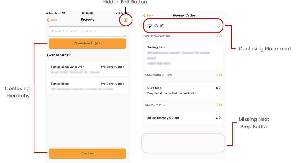
We identified the issues with the old Biiibo app and curated a list of key areas of improvement as defined below:
OLD CHECKOUT
Reframing the Problem
INSIGHTS
Our initial hunch made it clear that the existing checkout needed a refresh—but research helped us sharpen our understanding of the
issue. Based on user interviews and feedback, we defined the core problem as:
“How might we simplify the checkout experience to reduce cart abandonment and improve customer satisfaction?”
Understanding Technology Constraints
INSIGHTS
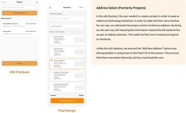
Before jumping into wireframes, we needed a clear understanding of the technical constraints shaping the current checkout flow. We worked closely with our backend engineers to map out these limitations and quickly uncovered a key factor: Biiibo’s system required users to create a “Project” before placing an order. Each project included an address, which the system used to process deliveries—an architectural quirk that heavily influenced the original, and often confusing, checkout design. For our redesign, the challenge was to embed this requirement in a way that felt intuitive and seamless to users, eliminating friction without compromising functionality.
WIREFRAMES
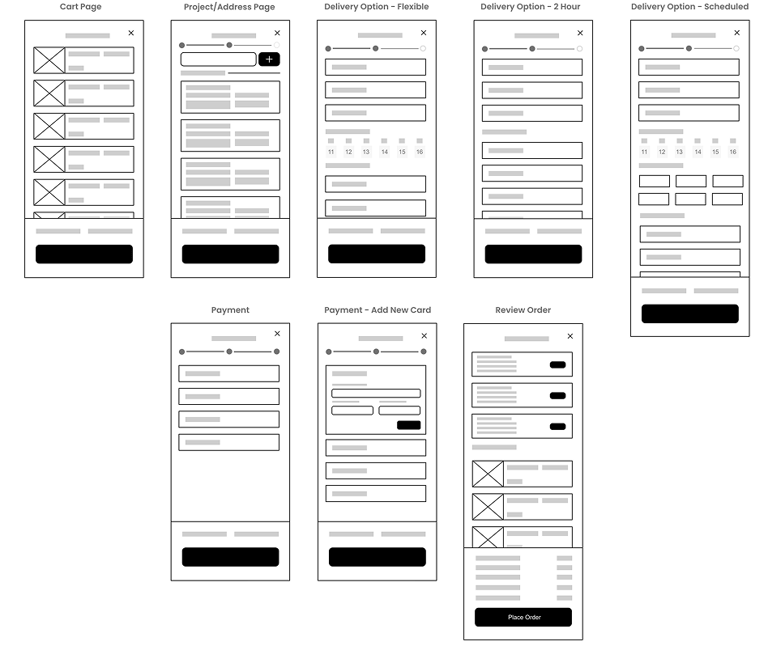
High-Fidelity Mockups
DESIGN
The wireframes helped validate many of our initial design assumptions. Once we felt confident in the direction, I moved into high-fidelity mockups to prepare for the next round of user testing with our participant pool.
Given the time constraints, it would’ve been easy to skip this step but for our user base, high-fidelity prototypes were essential. Many of our participants found it difficult to engage with low-fidelity wireframes and provide meaningful feedback without a clear visual representation. Below is a sample from our first iteration of high-fidelity mockups.
Testing the First Iteration
TESTING
For our first round of testing, we invited five users, two of whom had participated in earlier research sessions. To broaden our perspective, we also enlisted six internal employees from departments less familiar with the checkout flow, such as Accounting and HR. Each participant was given a pre-populated shopping cart and asked to schedule a flexible delivery for a specified date. I facilitated the session alongside the Product Manager, encouraging participants to think aloud as they completed the task. At the end of each session, we gathered open-ended feedback—both positive and critical—on the overall experience with the new checkout design.
Testing revealed two vital drawbacks to the initial design:
The “Add Address” button needed to be further highlighted as users spent a few seconds searching for it
The “Add New Address” and “Add New Card” sections had to be on separate pages. When presented together, users felt overwhelmed by the amount of information on a single screen, describing the section as cluttered and overcrowded.
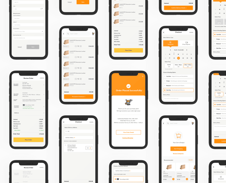
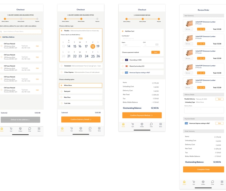
Final Design Highlights
FINAL SOLUTION
After multiple rounds of testing and iterations, the screens below were sent to production. I’ve highlighted a few key changes from the initial designs.
ADDRESS SELECT (FORMERLY PROJECTS)

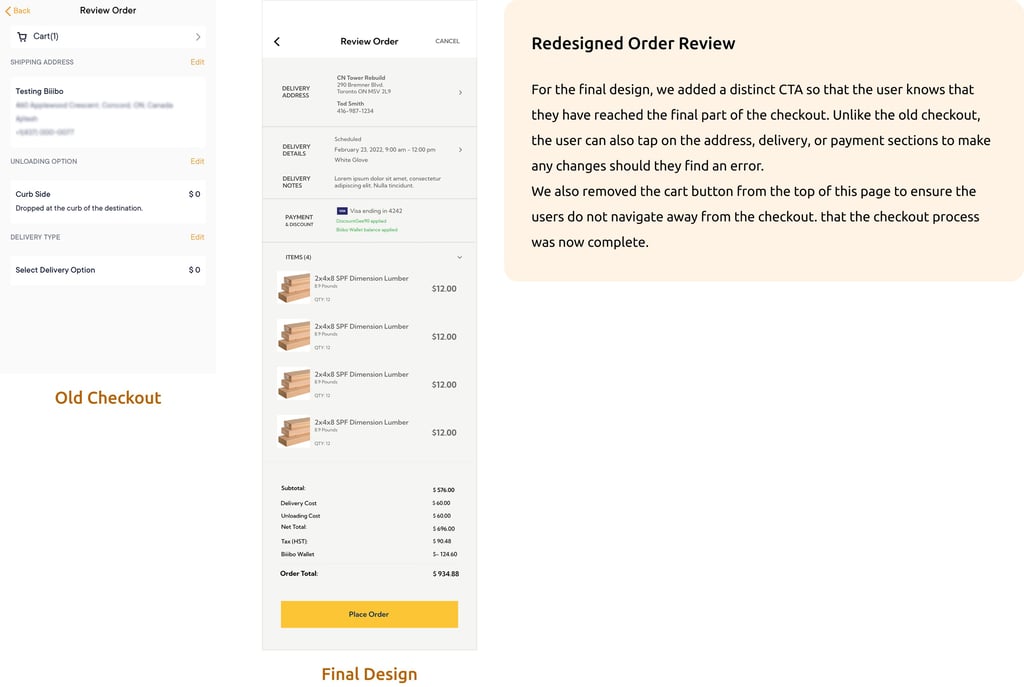
REDESIGNED ORDER REVIEW
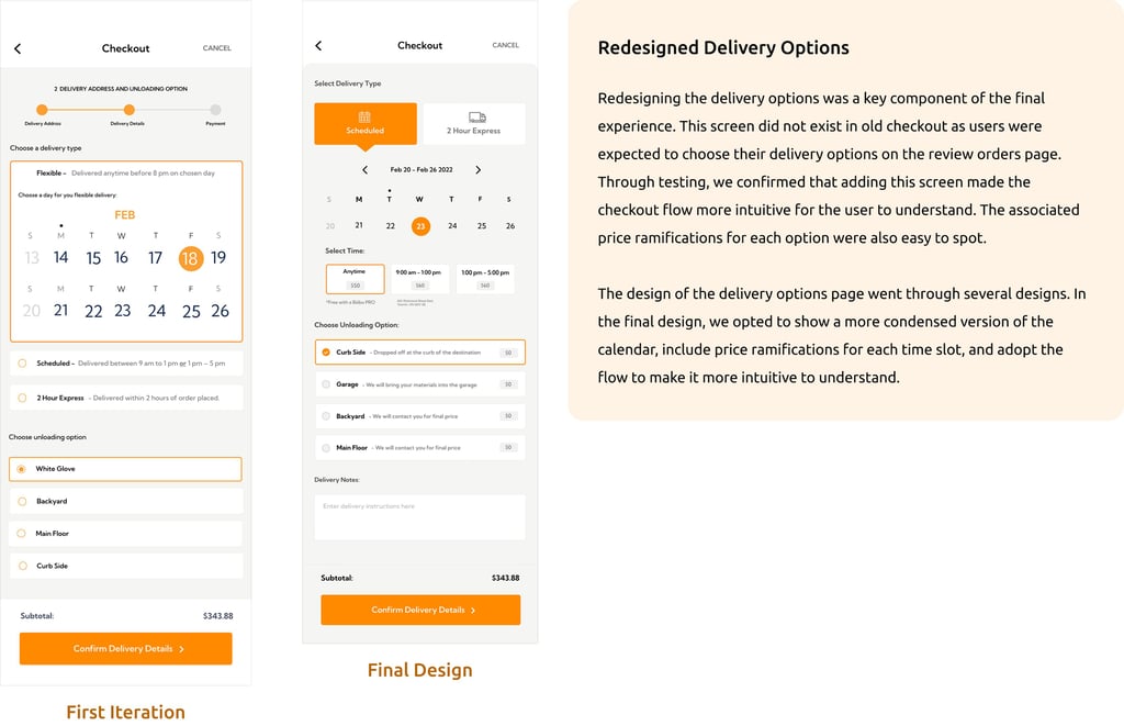
REDESIGNED DELIVERY OPTIONS