Elevating the ChargeLab Mobile Experience
A UX/UI case study
About ChargeLab
OVERVIEW
ChargeLab is a software platform for managing EV chargers, offering a cloud-based Charging Station Management System (CSMS) that works with OCPP-compliant hardware. It enables remote monitoring, billing, load management, and seamless user access for charger operators. In addition to the CSMS dashboard, ChargeLab provides web and mobile apps for EV drivers, creating a holistic, end-to-end EV charging experience. Unlike Tesla’s vertically integrated approach, ChargeLab is hardware-agnostic, which brings both complexity and flexibility to its users.
Role
Product Designer & Researcher
Tools
Figma, Miro, Prolific
Timeline
4 months
Context + Role
OVERVIEW
Over the past few years, the ChargeLab team focused heavily on improving the CSMS dashboard and web app. Both were built using ChargeLab’s design system and received generally positive feedback from customers. The mobile app, however, became somewhat of a forgotten child—visually inconsistent, built years ago with outdated patterns and irregular interactions. It was widely assumed that the app was rarely used and that most customers preferred the web experience.
That assumption was challenged during a set of unrelated driver interviews, where several users mentioned using the mobile app and shared frustrations with its design and functionality. This prompted a deeper look into the metrics, which revealed the app was not only being used regularly, but was steadily growing (adding 1.5% to 3% of the user base month over month).
In response, the Product and Design team prioritized a refresh of the mobile experience. As the Product Designer on the project, I led the redesign efforts, improving the UI, building in extensibility for future features, and ensuring that key decisions were informed by user research and data.
Time to Breathe Life Back into the Mobile App
PROBLEM + OPPORTUNITY
The metrics and the driver feedback weren’t the only feedback we were getting, a quick glance at the Play Store and App Store also showed disgruntled users. By this time, it was pretty clear that we needed prioritized a refresh of the mobile experience. This included a light refactor in Flutter, a UI/UX overhaul to align with ChargeLab’s broader design system, and the introduction of value-added features like social sign-in, Apple/Google Pay, and improved interactions. As the Product Designer on the project, I led the redesign efforts, improving the UI, building in extensibility for future features, and ensuring that key decisions were informed by user research and data.
Understanding Technological Contraints
LIMITATIONS
As the Core Experience team entered the discovery phase of this project, we quickly realized that the refresh would require close, thoughtful collaboration between Product, Design, and Engineering. Not only was the mobile app built on an outdated version of Flutter, but many key features were relying on web sockets instead of our core API. This meant the refactoring effort would be significant, so we would have to prioritize updating the most critical screens first.
Identifying Usability Issues
RESEARCH + INSIGHTS
Through conversations with drivers, internal stakeholders like the support team, and a careful review of usage metrics and App Store feedback, it became clear that we needed to first address the core flow of the mobile app—specifically, how a driver starts and stops a charging session. The existing experience (shown below) revealed several pain points, the most significant being a lack of guidance and feedback. Users weren’t given clear instructions on how to begin charging, nor confirmation that their session had successfully started.
CHARGER DETAILS BEFORE THE REDESIGN

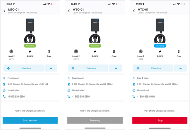
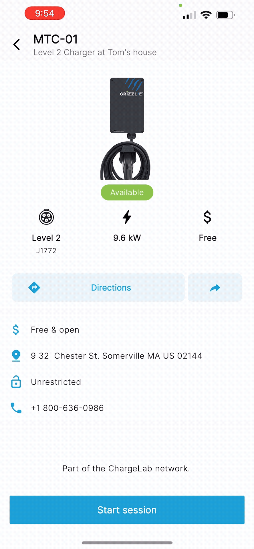
UI was not aligned with ChargeLab’s design system
Unclear who the unlabeled support phone number would connect to
Phone number had to be manually copied and pasted to make a call
Minimal feedback when a charging session was initiated
No real-time updates on charging progress
No clear instructions on when the connector should be plugged into the vehicle
Key Usability Issues Identified
Side Quest: Addressing the Plug-in Order
A/B TEST
While exploring how to better guide drivers through the charging process, we identified an open question around plug-in order—whether users should plug in their vehicle before or after starting a session in the apps, and how that sequence might impact session success.
In conversations with the support team, we learned that the support team often advised drivers to start the session before plugging in, based on anecdotal experience. Before redesigning the user flow around this approach in both the web and mobile apps, we partnered with the data scientist to run a quick A/B test on the web app.
We tested two flows: one that explicitly instructed users to start the session first, and one that gave no specific guidance. Surprisingly, the data revealed that prompting users to start the session first increased session failures, contrary to the support team’s assumption. This insight helped us avoid misdirected design work and instead focus on more effective, data-backed improvements.
PLUG IN ORDER A/B TEST
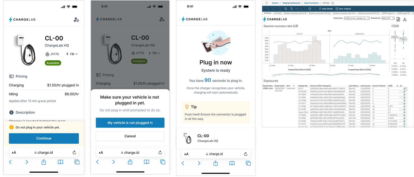
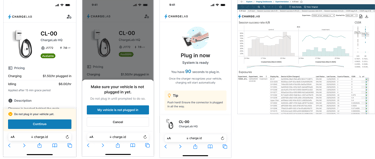
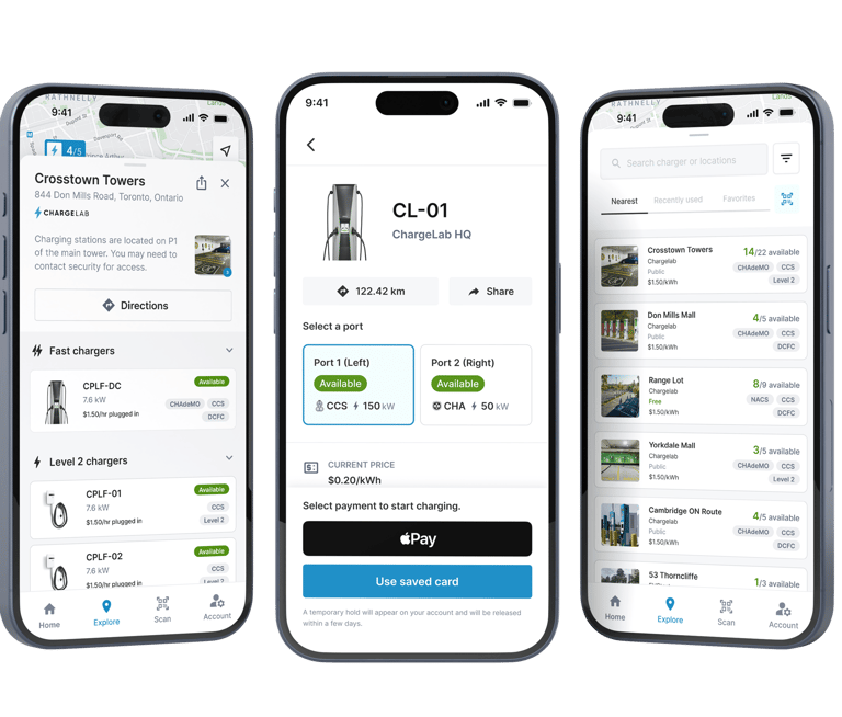
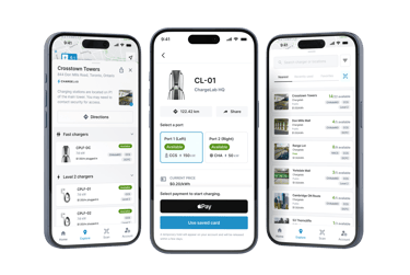
Final Designs
DESIGN
While the experiment didn’t produce the outcome we expected, we were grateful for the clarity it brought. With those insights in hand, we completed the redesign of the charger details page, ensuring that the key issues we identified were thoughtfully addressed.
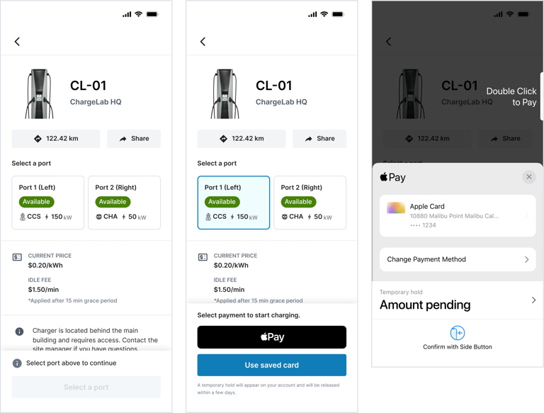
MOBILE APP AFTER THE REDESIGN
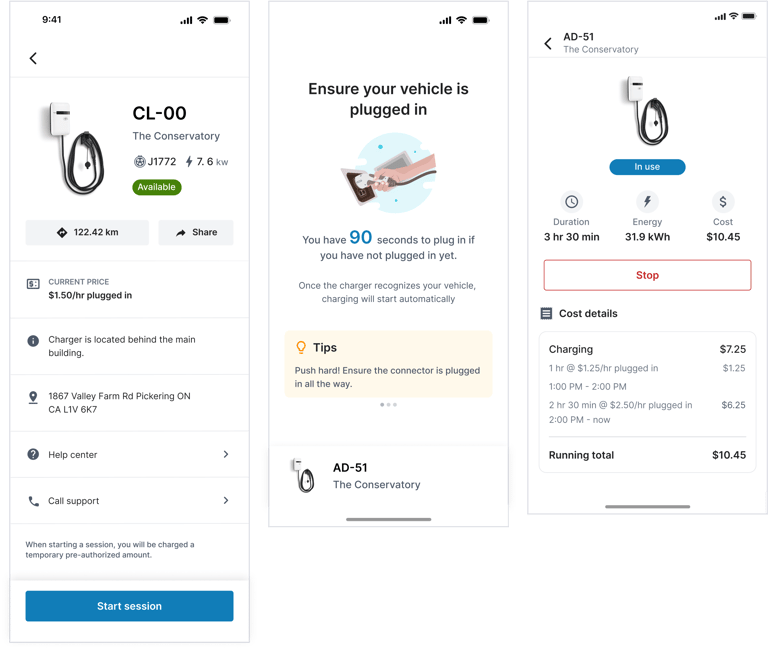
The UI was refreshed using the ChargeLab design system
Help features were made more user-friendly and easier to locate
A guided screen was added after a session is started to instruct users when to plug in their vehicle
A tips carousel was introduced on the plug-in screen to address common user issues
A “Session in Progress” screen was added to keep users informed during their charge
Key Updates
Iterating Toward a Better Mobile Experience
DESIGN
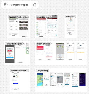
The charger details page enhancement marked just the beginning of our journey to improve the ChargeLab mobile app. Throughout the process, we stayed closely connected with users, gathering ongoing feedback and uncovering persistent pain points across the platform. In parallel, we conducted competitor analysis to better understand industry standards and identify the features drivers are most eager to see next. Much to our surprise, two of the most requested features—social sign-on and Apple/Google Pay—were still missing from many apps on the market.
IMPLEMENTATION OF APPLE PAY
While implementing Apple Pay in the mobile app, we had to balance technical limitations with speed to launch. In the first iteration, Apple Pay was only available to logged-in users, despite evidence that guest users would benefit most from the feature.
Launching Apple Pay with Tradeoffs
Making the Flow Intuitive for Drivers
Through multiple rounds of usability testing (both internally and with external EV drivers) we validated that prompting users to select the charging port before displaying payment options made the flow more intuitive and easier to follow.
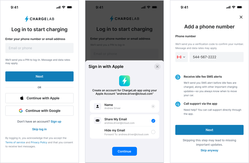
IMPLEMENTATION OF SOCIAL SIGN ON
A key challenge during the implementation of social sign-on was deciding how to collect phone numbers. In the context of EV charging, phone numbers are important because drivers may incur idle fees if they leave their vehicle parked after charging completes—and we use SMS to notify them. Our existing flow required users to provide a phone number during sign-up, but this conflicted with the simplified experience expected from social login.
To balance usability with operational needs, we introduced a separate screen prompting users to verify their phone number after social sign-in, including a clear explanation of why it's important and the option to skip.
Rethinking Phone Number Collection
Success!
OUTCOMES
Early data shows promising results: the redesigned charger details page, along with the addition of social sign-in and Apple Pay, has significantly reduced friction for users. One key indicator is the average time to sign up and start a charge, which dropped from 7 minutes to just 3 minutes—a clear sign that our mobile app improvements are delivering real impact.
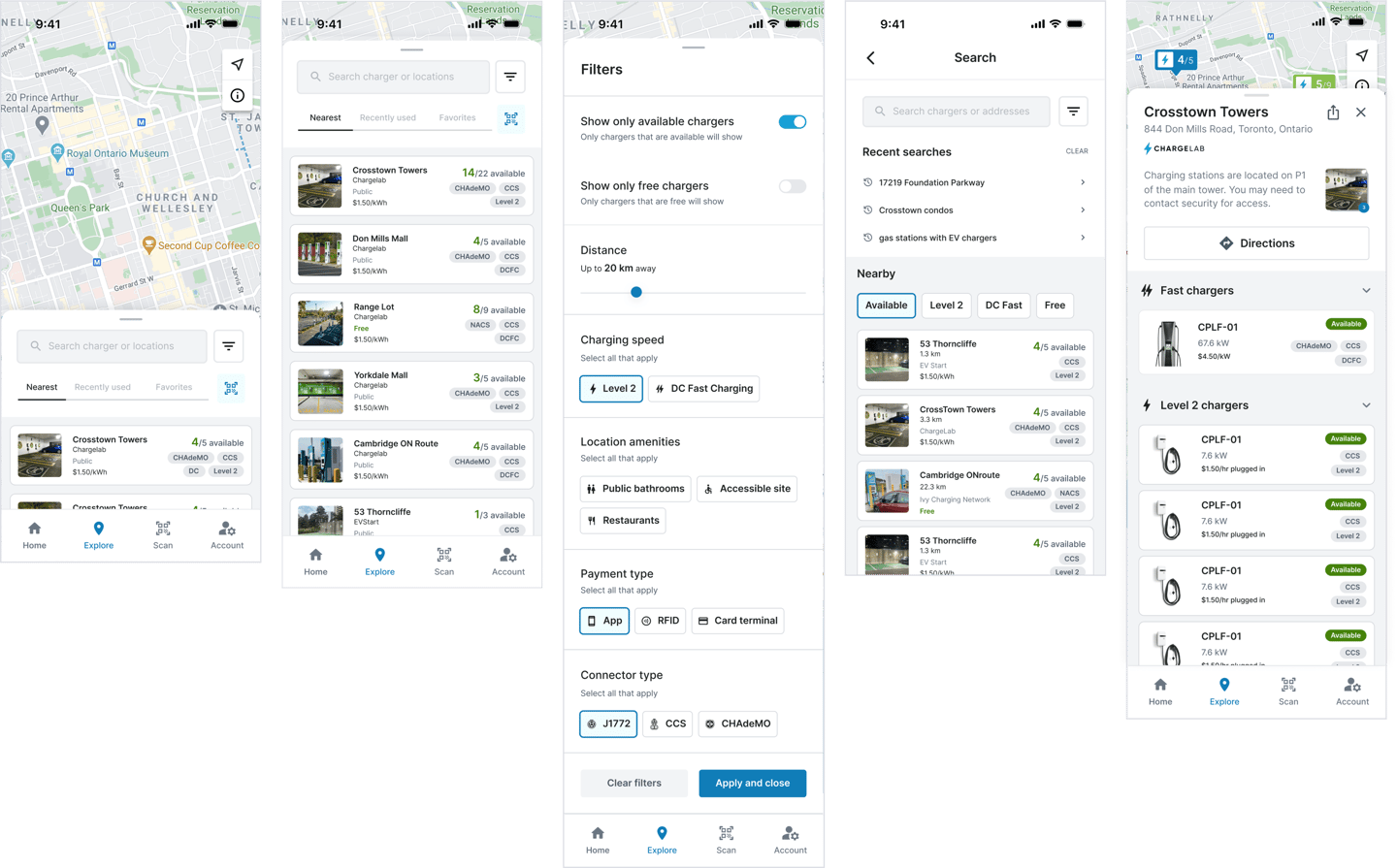
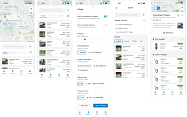
Vision for the Future
DESIGN
As we continued refining the mobile app, we uncovered opportunities to make the ChargeLab experience more intuitive and efficient. Two key areas of focus were search and filtering—essential flows for helping drivers quickly locate available chargers. The designs shown here represent our vision for a smarter, faster, and more user-friendly discovery experience.
EXISTING EXPERIENCE
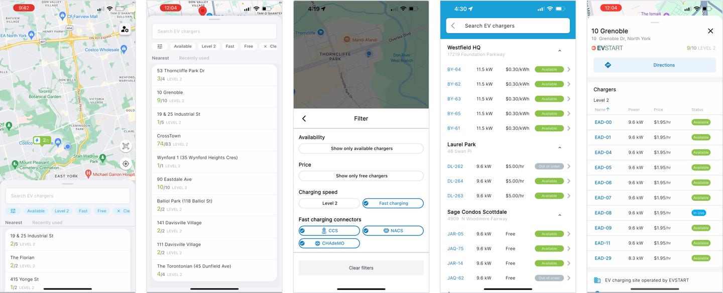
The current ChargeLab mobile app offers a basic search and filtering experience, limiting drivers’ ability to quickly find the right charger. Our redesigned vision expands filtering capabilities to include vital parameters like distance and payment type, while also helping users make informed decisions with better contextual information. Drivers would gain clear access to connector type, pricing, imagery, and access details—all surfaced seamlessly within the search and results experience.
Reimagine search, filtering and location preview
REDESIGNED EXPERIENCE